Worldwide TechServices
Client:
Worldwide TechServices
What they do:
Global IT field services
Focus:
Brand & Visual Identity, UX/UI & Web Design
Project info:
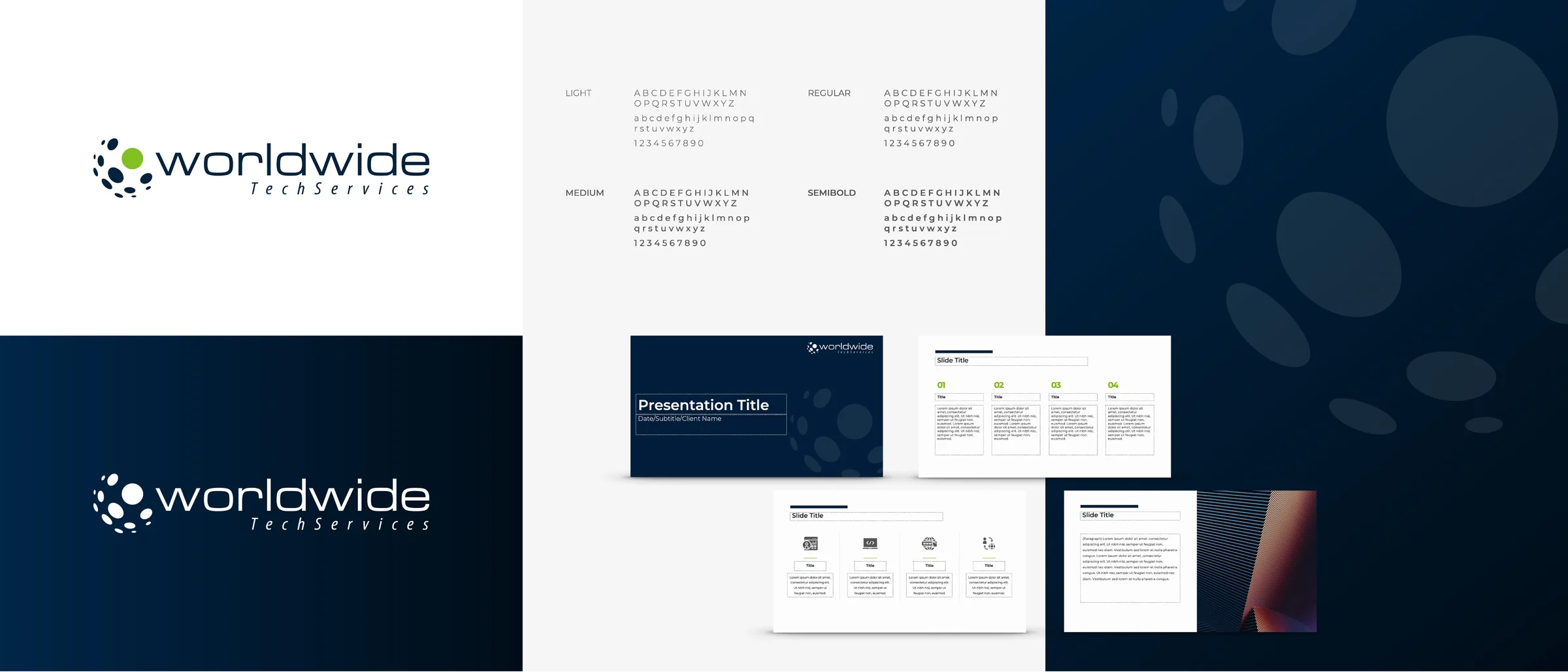
Worldwide TechServices (WWTS) is a global IT field-services company with more than 5,000 technicians across 180+ countries. Founded within Wang Laboratories in 1951, WWTS needed a modern refresh that retained its dotted-globe mark while creating a closer visual relationship with sister company American Technology Services (ATS).
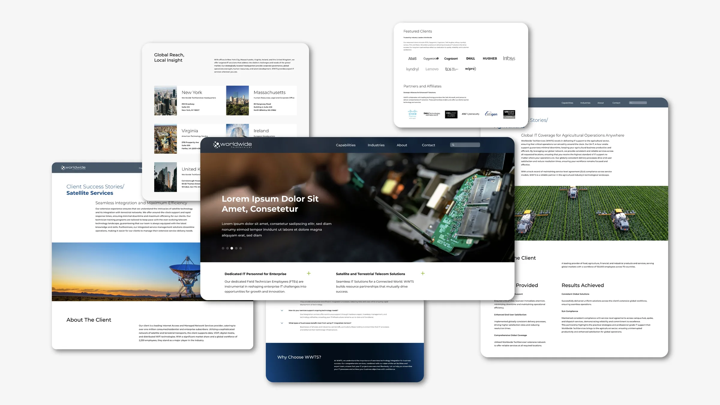
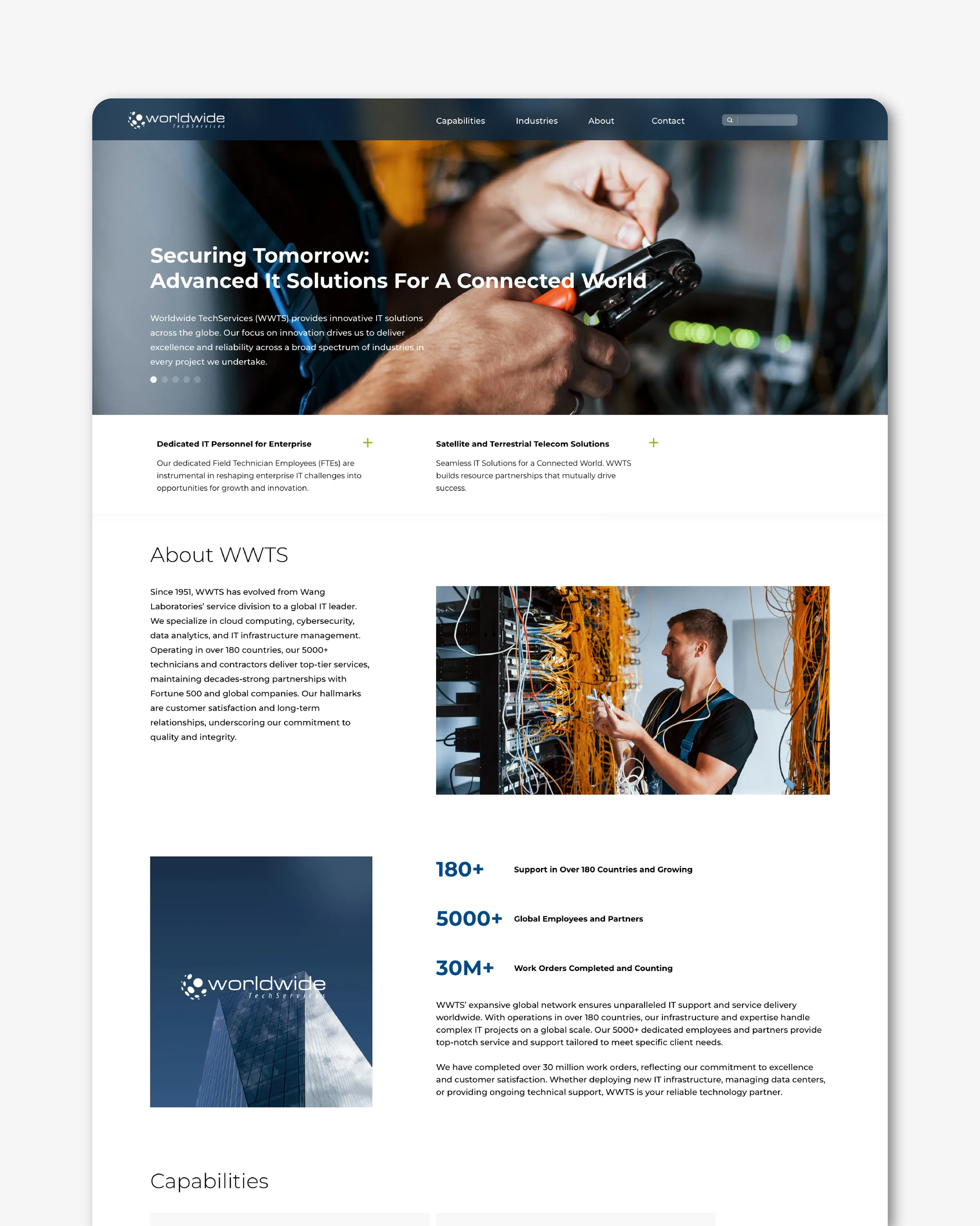
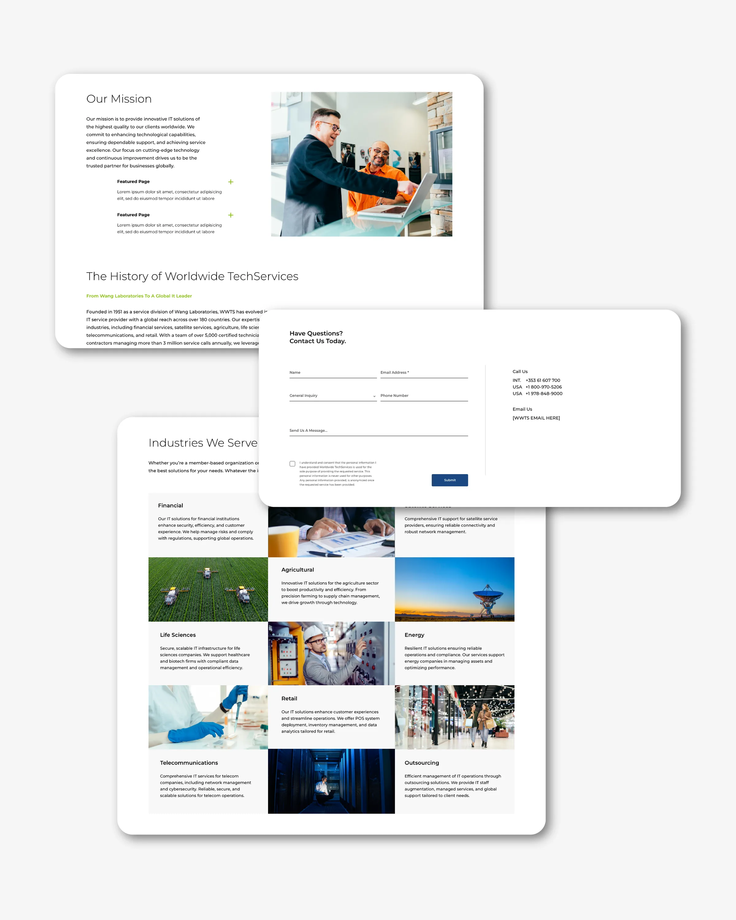
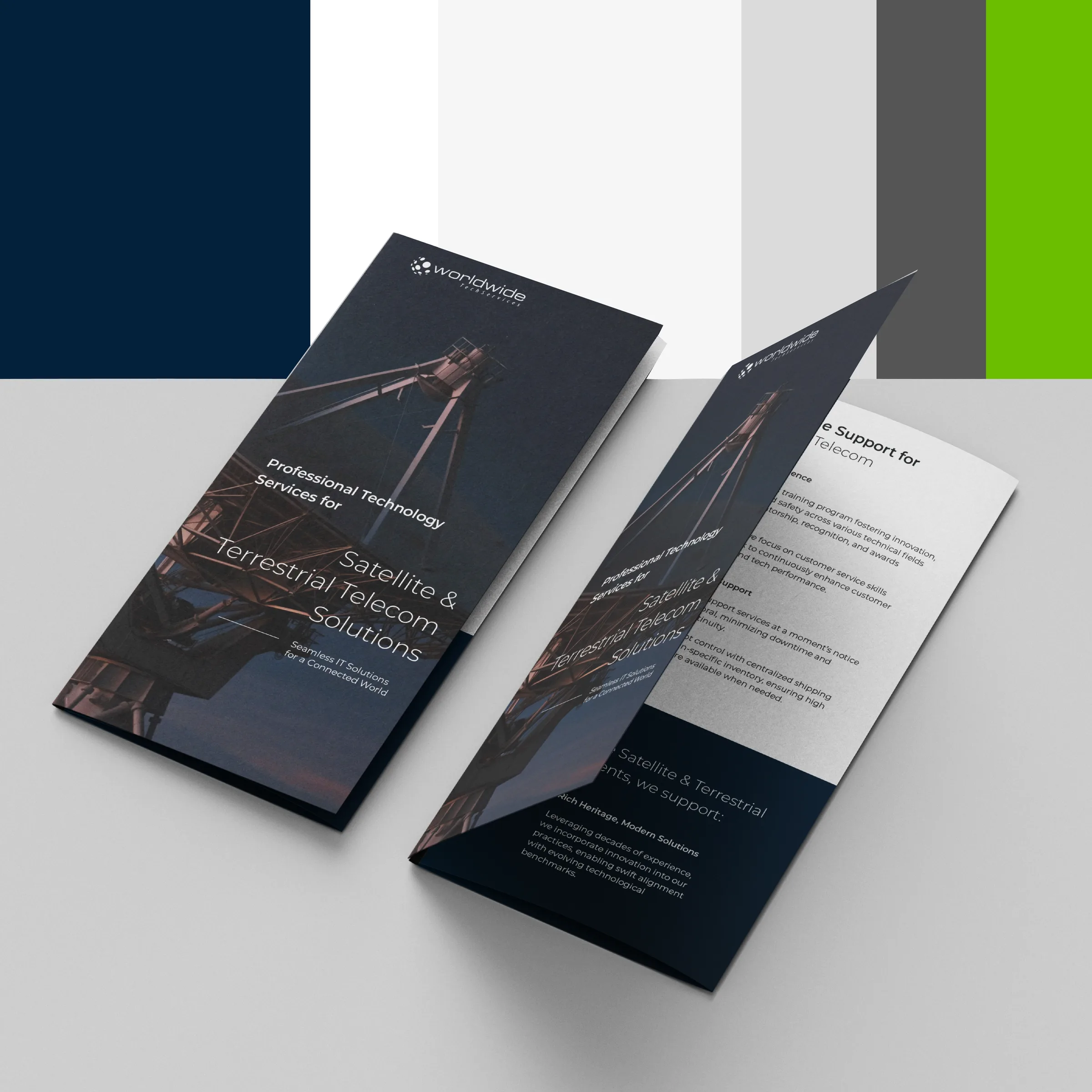
The new system introduced an updated color palette, typography, and layout approach across presentations, reports, whitepapers, and marketing materials. It then extended into a new marketing website, creating a more consistent brand experience across digital and communications.